|
  |
|

|
Cartania was made in the early days of the web in pre-CSS HTML
typed directly into a text editor. I wanted to keep the code so
simple you could read it straight and follow the content even without
a browser.
I was also learning as I went, so each page was a new experiment.
In Cartania, function often followed form instead of the other way around. I begin with an idea for a certain graphic effect
and then build a whole page around it.
About This Site serves
as an index to every other page in my site. For each page I provide a few design notes and links to the backgrounds I created.
|
|
 
|
|
Cartania - Page One
Darwin and Finch
|
This central page offers many links to other parts of my site. The two column format
creates an easily accessible menu of page links and other picture and text elements in a relatively compact space.
In 2003 I updated the original page to create a more lively look.
I replaced my photograph with an icon created by DV Graphics, replaced the old canvas background
with a more colorful Jagged Background (with bold lines that echo the icon artwork),
created a more cartoon-like title, and set all the photo icons at a jaunty angle.
Same content, same layout, but these few changes make a dramatic difference.
I added the Darwin and Finch satellite page when a visitor asked for more recent photos.
Its retro Cat Background was made using a character from the Webdings font.
|
|

|
|
Tower of Cartania
Grasshoppers vs. Ants
|
This was my first web page. I wanted to create a huge graphic that would run the length
of the page without consuming hours of download time. By taking a picture of nearby Coit Tower,
breaking it into pieces, and then stretching one small slice to a height of 4000 pixels using HTML's IMG HEIGHT parameter, I was able to create the "tallest tower in cyberspace."
To ensure a seamless blend, I set the background color of the page to the precise shade of blue
found in the original picture, 9CADBD. The text is from an essay on PONARVs I wrote back in
1988. One of the goals of this website is popularize this term so that someday it will find
its way into the dictionary. My satelite page features a nifty grasshopper background.
|
|

|
|
20 Strange and Wonderful Books
20 Even Stranger Books
|
I spent more time fussing with the layout on this one than I did writing the content. I
love book covers and wanted to show them, but most of my designs consumed too much
bandwidth. I finally decided to use simple thumbnails of the covers and create an extremely
spare black and white background so that those covers would stand out. I also experimented with generous use of negative space.
This is my first page geared toward wider screen widths, but everything should still fit
on a VGA screen. Adding all the internal and external links was a lot of work but makes for
what I hope will be a very functional page.
|
|

|
|
A Journey To Ireland
|
During my two week trip to Ireland I took 140 pictures with my trusty digital camera.
The challenge was first to pare that number down to a representative thirty and then to
present those as efficiently as possible. Shown at full size they would
take forever to download; but thumbnails were too small to enjoy. My compromise
was to display them at one quarter size. I set them against a dark green background
(#003300) and took extra trouble to frame each one in green and white. Then, in order to weave
them into an easily digestible story, I divided the pictures into
ten sections and wrote a litte blurb for each section.
|
|

|
|
Northwest Passage
|
I returned from Alaska with over 200 high resolution digital photos. The challenge here
was to present as many of these as possible in a way tolerable to people with small screens,
slow modems, or short attention spans. Instead of trying to fit everything on a single page, I tossed 2 of every 3 photos, greatly reduced and compressed the rest, and devised a set of 66 quick-loading micro-pages (small enough to fit on a VGA screen) floating against a labeled teal background designed to look nice at all window sizes. Because we zig-zagged all over the map, the pictures were taken in no coherent order, so to weave a more linear narrative I ordered them by latitude and grouped them into ten small piles. The buttons on each page allow viewers to skip ahead.
|
|

|
|
My Father
|
My father's memorial service was a celebration of a life well-led.
We had many photos, stories from friends and family, and selections of his favorite
music, including some Gilbert and Sullivan. The text of this page is the eulogy I
delivered that day. I kept the page design very simple and finally settled on web-safe
gray background (#CCCCCC) so that the top picture would blend cleanly even on low-res
browsers. The top picture shows Dad at my sister's wedding with Idaho's Sawtooth mountains
in the background. The lower picture is Dad and me on a car camping trip.
|
|

|
|
Flying Lesson
|
My goal for this page was to combine an essay on flying I had written in 1994 with a
wonderful photograph of the Golden Gate taken while on the flight described in that essay.
The trick was to allow the photo to emerge seamlessly from a bank of fog which could provide
a neutral background for the text. After much experimentation I finally distilled a very
workable fog background. By taking a circular crop of the
photo and brushing in the edges with the same fog pattern, I was able to achieve a
reasonable blending.
|
|

|
|
Digital Elph Photo Gallery
Prius Page
|
This page provided helpful samples in 2001 when digital cameras were first becoming popular.
The hardest part of this design was finding the right balance of quality and bandwidth for both the thumbnails and full-sized photos. I finally opted for high quality JPEG compression, but placed the file size beneath each thumbnail to give modem-bound users fair warning. I wanted a light, airy feel, so made all the graphics float with bare minimum drop shadows against a minimalist graph paper background. I also lightened the text color to #666699, a shade similar to the light blue used in the header graphic. The photo of the Elph camera was created by simply holding it over my flatbed scanner. I retired this page in 2009.
|
|

|
|
Old Ricoh Photo Gallery
|
Since the whole point of this page was to show off pictures taken by the Ricoh, my first digital
camera, I wanted the decorative elements to be taken from such pictures as well.
Fortunately, the LCD monitor of my camera was detachable, so I was able to take a picture
of the monitor and use that to fashion a frame for all the other photos. Since the four
pieces comprising the frame are used repeatedly, they can fill the page but only have to
be downloaded once. The picture of the camera itself is a photo I took of a magazine ad.
Even the steel background color, 576B77, was derived from a closeup of the monitor. The
metal section titles and grooves, however, were made from scratch in Photoshop.
|
|

|
|
Desktop Images
Desktop Images 2
iPhonaramas
Fabric Designs
Mad Scientist Desktops
Point Reyes Panorama
|
My desktop images are all based on my photographs, some taken with the digital elph,
and some with a USB microscope. I wanted a simple, clean backdrop to present the thumbnails, so based the
layout on some of the automatic web pages Photoshop creates.
The fabrics page uses a similar layout but with a different color scheme.
My fabric designs are all taken from graphics on the Cartania website;
each necktie links to a 3-line html file which simply fills the page with a single GIF.
The Scientist background used on the
Mad Scientist page incorporates a photo of the animatronic statue of me that my friend Eric Stilan used
in his Halloween exhibit.
|
|

|
|
Essay On Turning 36
|
I tried to make this essay look as if came out of a typewriter. The suprisingly compact Escher background creates
the illusion of eight separate sheets of paper floating above an elegant design in
soothing browns. Some careful spacers and table definitions ensure that the words stay on their
proper pages despite variations in browser margins and font sizes. Jump buttons to the right
of the pages quickly position each page just right even on very small screens.
|
|

|
|
Mid-Life Crisis
|
My dear friend Jo Anna Wool enjoyed this letter so much she suggested I put
it up on my site as an essay. The title graphic includes a selection from
the painting Ullyses and the Sirens by J. W. Waterhouse. I cropped it
severely and dithered it down to a web-safe pallette. The text is dark blue
to match the salutation and suggest blue ink on white paper.
|
|

|
|
Falling Silent
|
I waited five years before writing this essay about a weekend retreat I took to Big Sur.
When the words were finally written I used some of the photos I had taken to decorate the page.
I choose my favorite for the title and used its green hills to define the text's background color (95A076).
I borrowed some ocean from another to create the silent sea background.
The hardest part was choosing only three more for the rest of the page.
|
|

|
|
Who Do We Dream Against?
|
When I redesigned this page, my goal was to employ surreal imagery. I sprinkled
some bizarre 19th century (copyright-free) animal engravings onto a sleepy
parchment background and used a dreamy
shade of brown for the text (7D4929). I then colorized, cropped, and distorted
some of these same animal images beyond recognition to create the colorful side
panel. I made it abstract enough to survive stretching so that the second occurance
of the panel could grow to fit any type size.
|
|

|
|
The Museum of Play Maps
|
The museum took years to create and is much bigger than it seems at first.
This is intentional; I wanted visitors to feel like cavers who squeeze through
an ordinary tunnel and suddenly find themselves in a vast chamber. Each exhibit
has a different look and feel, but the museum background
defines a common approach with a distinctive left gutter and fixed area for text.
The lions are a detail from J. W. Waterhouse's painting, "Miriamne Leaving the Judgement Seat of Herod."
|
|

|
|
Feudal 3D
|
This is one of the simplest exhibits in the Museum of Play Maps. It was basically built to
house a scanned image of a large map I made as a child. The map itself was lost for many years,
but was found again by my mother when she cleaned out our house after dad died. I had to scan
it in pieces and assemble it all in Photoshop. The feudal background
was inspired by the cardboard case that housed the original 3M Feudal board game.
|
|

|
|
Alexander
|
I went through over 30 iterations before settling on the alexander background
for this exhibit. The main text area and right gutter were inspired by one of the posters I did for this
project and are supposed to suggest the contrast of land and sea. The left gutter has a grid reminiscent of
a board game. The dialog section includes over 170 pages of hand-coded HTML and a near-perfect replica
of a HyperCard stack in a separate pop-up window.
|
|

|
|
Mapping Montana
|
I normally avoid dark backgrounds, but in this case went dark to dramatize the pictures.
The raindrop background has a left gutter taken from a photo of raindrops on glass,
a dark gray (111111) interior, and a noisy green right gutter to hint at a Pacific Northwest flavor.
I sized the pictures to a uniform width and kept the captions short to ensure even spacing.
The text and link colors are the same used on some of my other dark pages.
Although I spent some time reducing the file size of each image,
this page takes still takes a longer time to load than most of my other pages.
|
|

|
|
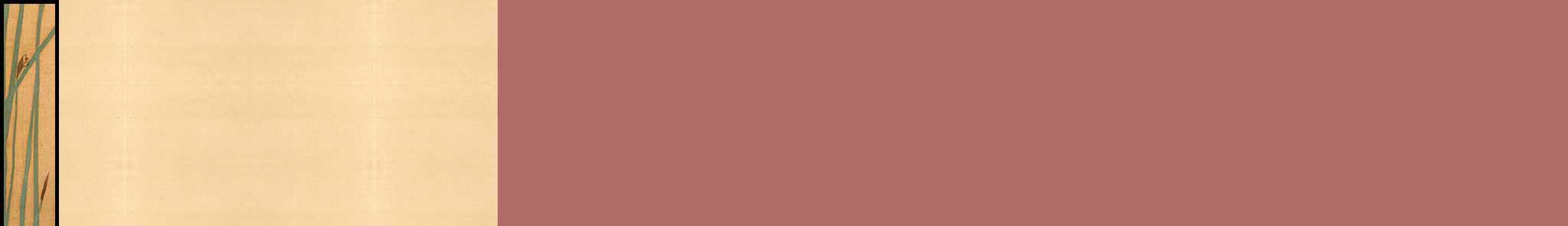
Starmaze
|
Unlike the other exhibits in the Museum of Play Maps, the starmaze exhibit is still active so I fully
expect to add new pages and revise existing ones. Because my explorations into the maze
have taken so many surprising twists and turns over the years, this exhibit
is sprawling, multi-faceted, and hard to organize.
The starmaze background was designed to harmonize with the
dignified, ancient-looking Asian design I devised for the starmaze puzzle patterns.
The reeds are a detail from "Egret and Water Plant" by the 18th century Japanese artist Hoitsu.
|
|

|
|
My Springfield
|
Since this page enshrines the city I made while playing the Simpsons Tapped Out game, it seemed appropriate to create
a springfield background taken right from the game itself.
I used a section of rocky beach, rotating it to produce a vertical shore. The bulk of the background are
light and dark greens (82B77D and 3D7744) used in the game to represent purchased and unpurchased land.
The most challenging part of this page was creating a version of my map that would load in both
desktop and mobile browsers.
|
|

|
|
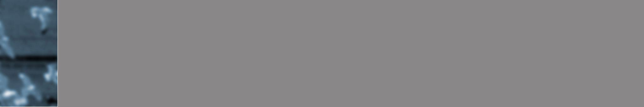
Archipelago
|
At just under 3000 pages, Archipelago is far bigger than the rest of Cartania put together.
It took a year of hard work to convert 1980s-era HyperCard stacks into 33 volumes of
deeply interlinked HTML pages. The pages are designed to recreate the experience
of navigating through the original stacks while adding the look and color of Cartania web pages.
To achieve this effect, over 220 graphics were created and placed against a blue-green
seagull background based on the original
monochromatic startup screen, and each page was then edited by hand.
The end result is, I hope, both a time capsule and a cabinet of wonders.
|
|

|
|
A Table And Four Chairs
|
For this page I spent some time finding just the right shade of blue, and then used it
in the title, in background elements on the left and right, and for both line and dot
separators throughout the text. I wanted to maintain a comfortable text width of about
a dozen words per line, so I created a light (6K) but wide
background which provided an interesting margin on either
side without repeating even on wide screens. I built my separators out of a single
blue dot - a clean look with almost no download time.
|
|

|
|
Aristippus
|
This essay is essentially a funeral oration, so I chose a black background and a faded,
melancholy blue text color in an attempt to create a somber mood. For the title, I used
the same shade of blue (637B94). The graphics at the top and bottom were taken from frames
of a movie I made of me morphing into Aristippus. I formed the bottom image first and then,
while playing, discovered that the inverse of that image transformed Aristippus into a
fierce and magical jaguar.
|
|

|
|
Teaching Tolkien
|
The central challenge with this design was how to present six different discussion threads in a
coherent fashion. My solution, color-coded maps and distinct comment boxes, was tricky to hand-code
in HTML, but I finally got it to work on both Mac and PC browsers. The inset photos of
me and Stuart added a surprising amount of warmth. The manuscript background
incorporates the Elvish script from my wedding ring: "John and Betsy".
|
|

|
|
Gilligan Unbound
|
My friends keep asking to read this story, which I wrote 20 years ago, so I finally
put it up on the web. It's fun to play with pop-culture characters; the audiences of ancient
Greece enjoyed their plays all the more because they came to the theater already knowing all
about the gods and heros they saw on stage. Characters from classic TV shows are the gods and
heros of my generation and anyone who went through puberty with Gilligan's Island
playing in the background will understand the forces this story grapples with. As for presentation,
I used a simple layout and slightly softened text color (333333) on an easy to read
parchment background. The title graphic was made using
the Sand font with a palm tree from the Webdings font.
|
|

|
|
Artist Biography
|
When I retired and shifted my focus to generative art
I felt the need to replace my circa 2000 "What I Do" page with an
artist biography. I decided to keep it simple and friendly,
just a photograph and some text. I centered the content
in a white one-cell table against a white background
and called it a day.
|
|

|
|
What I Do
|
I wanted a page that would help people understand my work, whether it be friends and
relatives or potential clients. I started by carefully writing and editing the text. I then
thought it might be fun to play with table cell background colors, and
settled on a checkerboard layout. I began by picking the (web-safe) colors for the graphic cells.
Once these were in place, I realized that I had to show borders around the cells (which I normally
hide) and use a neutral
gray textured paper background that contrasts well
with all five colors. Then all I had to do was find or create graphics and key them to the chosen
colors. The final graphic is from a style guide I did for one of my clients.
|
|

|
|
Work History
|
I suppose a resume should be completely practical, but in keeping with the
ponarvian nature of this site, I centered the design of my online work history
around a completely superfluous painting of me daydreaming in my cubicle. I used
the rather nice tan texture from the picture to form section blocks, sized to fit
snugly on a 13 inch display - clicking a block automatically scrolls to the next
section. To bring more balance into the design I created a
gray textured paper background (based on the tan section blocks) with a subtle
stripe on the right.
|
|

|
|
About This Site
|
Because this page occupies a central position in my site, and grows steadily longer as
my site expands, I took special care to make it clean, efficient, and functional. In
designing the graphics, I played off the minimalist navigation bars which link to it
from every other page, carefully chose a web-safe neutral background color (FFFFCC),
designed the page icon bars to be attractive, yet very low bandwidth, and limited
the text so that each description will fit on a 13 inch display without scrolling.
|
|

|
|
Guest Lounge
|
When I decided to rearrange my old guestbook and visitor pages into a centralized,
refurbished visitor's lounge, I was in a retro mood and whipped up the whimsical, 50's era
bubbles background in less than 30 seconds. I made the guestbook form as clean and simple as possible. The map, which I update by hand, was
taken from the Macintosh Map Control Panel; this colorized version is dramatic, easy to
read, and quick to download. I updated all pages to the new look and feel, but nostalgic
background hounds are still welcome to use the old notepaper background.
|
|

|
|
What's New
|
This page performs a simple function and I wanted a simple, clean design,
but for some reason it took me ages, and countless permutations, to get the look I wanted.
The anchoring image of the little bird is a detail from an ancient Japanese painting.
The suggestion of a sun behind the bird is echoed in the new sun background.
I purposely left out the usual navigation buttons so that visitors would be encouraged
to try a new link.
|
|

|
|
Family History
|
The distinctive fading faces background used on this page
was distilled after many difficult compromises. I started with a 19th century graduation
picture of one of my ancestors. After much experimentation I achieved a properly positioned gradient from pure white to an evocative but not overpowering sea of faces, trimmed down to a
reasonable bandwith. This design looked spectacular on the Mac, but melted down to garish
circus colors on the PC. After dithering to the Netscape palette, the design was only fair
on the Mac but did not degrade on the PC.
|
|

|
|
Sarah
Our Child
Newborn
Bat Mitzvah Speech
|
These pages employ a very simple two column format with consistent title headers. The original "Our Child" page displays diagrams
scanned from various pregnancy books; I choose simple drawings and then re-sized and colored them to create a consistent look.
The other two pages have a similar layout and color scheme. The our child background
is a simple gradient to a warm pattern scanned from one of the pregnancy diagrams with a right gutter exactly matching
the parent history page.
|
|

|
|
Sarah Month by Month
|
My goal with this design was to convey the element of time, and allow easy navigation through time, without distracting
from the photos themselves. I tucked the photos in the upper left corner so they can
be seen without scrolling, and saved more space by showing the date vertically.
The minimalist calendar blocks show the current point in time and allow quick navigation in a subtle way. Controls
and titles are in a quiet gray against gray (333333) background to minimize distraction. I used Hypercard to
pre-generate sixteen years worth of pages, so adding new photos each month is a snap.
|
|

|
|
Genetic History
|
This page was pretty much stolen from the report I received from the
National Geographic Genegraphic Project.
My layout was a cross between one of my typical pages and their report page, including their 014B96 background color.
I trimmed their map and lightly edited their text.
|
|

|
|
Ancestor Timeline
|
The challenge for this page was providing a four VGA screen tall, million plus pixel diagram without slowing everyone's modem to a crawl. By limiting the palette to four colors (no anti-aliasing) I was able to keep the GIF to only 30K. Each of the thirty male and female lifelines is numbered according to the standard ahnentafel scheme (for each person N, father = 2N, mother = 2N+1).
|
|

|
|
Hogue Genealogy
|
This is a simple center floating page, similar to the Genetric History page, but with a different bg color (C1BDA9).
The page contains three images, two of which link to PDFs. The real design work in this case was creating the remarkable chart.
|
|

|
|
Cartan Family Tree
|
This photo-laden diagram was originally created as part of a label, printed on fabric,
for a magnificent photo quilt my wife made for my grandmother on her 90th birthday.
For this web page I presented it unchanged on a simple white background. The colored
icon in the upper left corner shows the relationship of this branch to the larger family
tree described in my Roger Peter Cartan genealogy.
|
|

|
|
Descendants of R. P. Cartan
|
For me, the greatest challenge in designing the presentation of this genealogy was finding
ways to link the text entries for each member with a graphical representation of the larger
structure. In all four pages I used variations of the same color-coded tree diagram
drawn to three different scales. The entire tree appears in miniature at the top of each page
along with the particular branch drawn at a large scale. A medium scale version of the same
branch with a hilighted slice separates each generation.
|
|

|
|
Dog Tales
|
This curious collection of my father's stories demanded a custom theme suited to its nineteenth century
flavor and its obsession with dogs. I created a dog fur background
and three headers and illustrations from a collection of copyright-free Victorian animal engravings.
The faded (F4EDE1) page background color and brown (330000) text color matches the illustrations
and, I hope, lend to the charm.
|
|

|
|
A Fine Education
A Love Letter
The Road to the Cemetary
Civil War Diary
Civil War Reflections
A Letter From Oregon
Dispatches from Montana
Harold's War
Frederick Owen Cartan
One-Room Schoolhouse
Great Expectations
Scenes From A Wedding
|
Since I plan to create a number of these family story pages, I wanted a design simple
and versatile enough to serve as a general purpose template. I choose a solid color
background with subtle trim graphics on the top and bottom. I think the light brown
color (FFDEAD) provides a warm, old-fashioned backdrop which still leaves the text
easy to read. The faded green trim includes a monogram I plan to incorporate throughout
the site.
|
|
   
|